Our clients are ridiculously good looking.
And when you’re lookinG good, PEOPLE notice.
Serving a variety of different clients, industries, and business models keeps us on our toes, minimizes any potential conflict of interest, and amplifys our creativity.
By Service
- Creative
- E-Commerce
- Education
- Engineering
- Entertainment
- Event
- Fashion
- Food and Beverage
- Healthcare
- Insurance
- Interior Design
- Law
- Legacy
- Library
- Marketing
- Municipal
- Music Industry
- Non-Profit
- Parenting
- Publishing
- Real Estate
- Restaurant/Catering
- Social Media
- Spirituality
- Subscription Box
- Technology
- Trade/Service
- Wedding
- Wellness
BY INDUSTRY


Wilson Wolfe Real Estate
In a nod to Wilson Wolfe’s 40+ year legacy, our new visual identity highlights a howling wolf and the brand’s iconic yellow. The sitting wolf creates the final arm of a new “W” monogram. Smart, easy to understand, and elegant, the look is approachable and honors the good-natured appeal of Wilson Wolfe. Studio Eighty Seven led the redesign of the new-and-improved Wilson Wolfe website, and assists the internal marketing team with all brand touch-points including direct mail, listing marketing efforts, signage, and social media.


Main Street Endodontics
Located in the historic Main Street Exchange building in Worcester, Main Street Endodontists is led and owned by board-certified Dr. Ivy Pruitt—the only female and third board-certified Endodontist in Central Massachusetts. Inspired by the history and legacy of the Exchange building The Main Street Endodontics brand is welcoming, reassuring, and professional. Timeless and classic visuals exude trust and confidence. The brand is immediately recognizable as reliable and trustworthy through a timeless and classic visual identity. The typography is a high contrast modern serif paired with a modern sans-serif providing the perfect foil to the straight lines of its counterpart. The decorative line is inspired by the architectural detail of the building and dentil moulding.
Middletown Public Library
Middletown Public Library is welcoming, friendly, and reliable. An entity you can rely on to help you explore, discover, and learn. They’re professional and knowledgeable in a convivial manner. The new logo is representative of Middletown’s geography, and highlights a connection to the local schools and education. The modern illustration depicts pages of a book transforming into waves crashing to shore. The illustration symbolizes transformation, and how what’s found inside a book, or library can transform us.

Franciscan Children’s Hospital
Studio Eighty Seven works directly with members of Franciscan Children’s Hospital in-house marketing team supporting all internal and external marketing initiatives—from flyers, website graphics, signage, and branding support—Studio Eighty Seven is tasked with insuring the Franciscan Children’s brand is consistent across all platforms.

Down Under Yoga
Down Under Yoga is Boston’s premier destination for yoga, fitness, and yoga teacher training trusts Studio Eighty Seven to support their small corporate team with a variety of tasks from print design, signage, and website design. Studio Eighty Seven worked closely with the marketing team and founder on a complete overhaul of their brand guidelines.
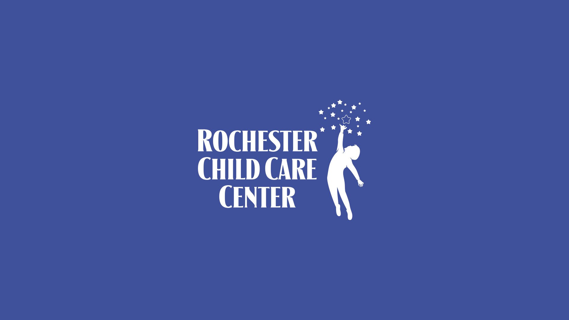
Rochester Child Care Center
Rochester Child Care Center (RCCC) is a non-profit child care center that provides quality, nature-based child care at an accessible price for families in the Rochester, New Hampshire area. Studio Eighty Seven was tasked with updating their site so that it better reflected and communicated RCCC’s mission, values, and programs, and provided access to information and resources to prospective and current families. Working closely with the RCCC team, Studio Eighty Seven transitioned the site from Wordpress to SquareSpace 7.1 while defining a new visual language—including a defined color palette and typography—for the brand. Drawing inspiration from RCCC’s new exterior signage the site is bold, colorful, and easy to navigate. It also features custom icons and illustrations that break-up text heavy pages, and visually communicate a nurturing and engaging child care environment. Better still, behind the scenes, the site is easier for the RCCC team to update in-house cutting website maintenance costs.


The Pine Bar
The Pine Bar is a bar launched in Boston Public Market, celebrating craft beer and cocktails made with quality ingredients direct from the best vendors throughout New England. Inspired by colors around Boston (most notably Fenway Park), indoor European marketplaces, the landscape of New England, and a custom neon sign, The Pine Bar brand is at once nostalgic, familiar, authentic, and versatile.

Supported Mom Initiative
Logo and branding design, and website design and development for Supported Mom Initiative of Central Massachusetts.